Latitude vs Temperature

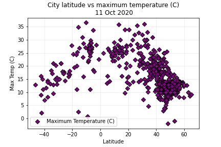
The plot shows the cities temperatures in relation to the latitude. Common sense expects the highest temperatures along the equator, which is 0 latutude.
The plot shows that indeed the highest temperatures are measured along the equator. The plot also shows that the population is most dense between 40 and 50 degrees latitude, which is most of Europe.


